

The Problem
With a small marketing team stretched thin across several brands, and two new enterprise-grade SaaS products to release, Squirrels needed a shift in design methodology to accommodate a pivot from consumer to B2B sales. The Ditto website was the new service’s primary point-of-sale, and the perfect place to prototype our new web design and marketing processes.
Brand advocacy and word-of-mouth were no longer primary marketing drivers. Our new services required a polished, professional and friendly presentation that communicated ease of use as well as industry expertise. The Ditto website was designed to be a scalable centerpiece for marketing endeavors moving forward.
My Role
As Creative Director, I was the primary developer and driver of our new digital design process. I researched, pitched and oversaw the execution of the website. I was also the lead UX/UI and graphic designer on this project.

Before official kickoff I worked with our BI Analyst to research and compare brand heroes and competitors to our current site. We researched site traffic, UX trends, layouts and even letter counts for titles, paragraphs and CTAs. The data we gathered informed an audit of our site at the time, and provided key metrics for my stakeholder pitch.
After kickoff, I worked with two marketers–Sid, the Marketing Partner, and Tom, Director of Communications–to generate the sitemap, determine optimal layouts and create content.
In the last three weeks I invited our Product Designer, Cory, to help me audit the site and generate hero banners. He also helped me envision page flows and site structure early in the process.
I handed hi-fi wireframes off to Matt, our Web Developer. We spent a few days editing the site according to his requirements and a major project restriction: a four-day window to develop the entire 28-page site.
The Solution

We designed 28 pages using a UX card system and a tiered sitemap.


User Personas
The Casual Browser
A layperson, likely an end-user or cross-traffic from other product pages.
Requires easily scannable and digestible information about the product.
The Interested Purchaser
Smart, savvy and responsible for communicating value to key stakeholders in an organization.
Typically looking for technical details, feature sets and use cases.
Metrics of Success
An email campaign proceeding the site redesign saw 200,000 opens, a 24.6% open rate and a 5.7% click-through-rate.
A follow-up email campaign the next quarter saw 84,000 opens (20%) and a 1% click-through-rate.
Our efforts maintained an open trial count of roughly 100. The rate spiked to around 400 with each email blast.
Ditto sold over $350k in 2018, three-fold sales in 2017. By early 2019, over $700k was in the sales funnel.
The new web design process was iterated and implemented in five other redesigns: ClassHub, Reflector 3/Reflector Teacher, Squirrels, the Squirrels Blog and a second series of revisions for Ditto.
“Jon was pivotal in developing the vision for the new Ditto marketing site. He researched current design trends and adapted his skills to create a modern and sophisticated website. The successful redesign was a direct result of his time and efforts.”
Approach
Research & Site Audit
I researched best practices, analyzed brand heroes and competitors, and worked with our BI Analyst to audit our site and prepare for a stakeholder presentation. Key findings led to a significant shift in branding, improved layout, a stronger information hierarchy and a far more intricate navigation system.


Sitemap
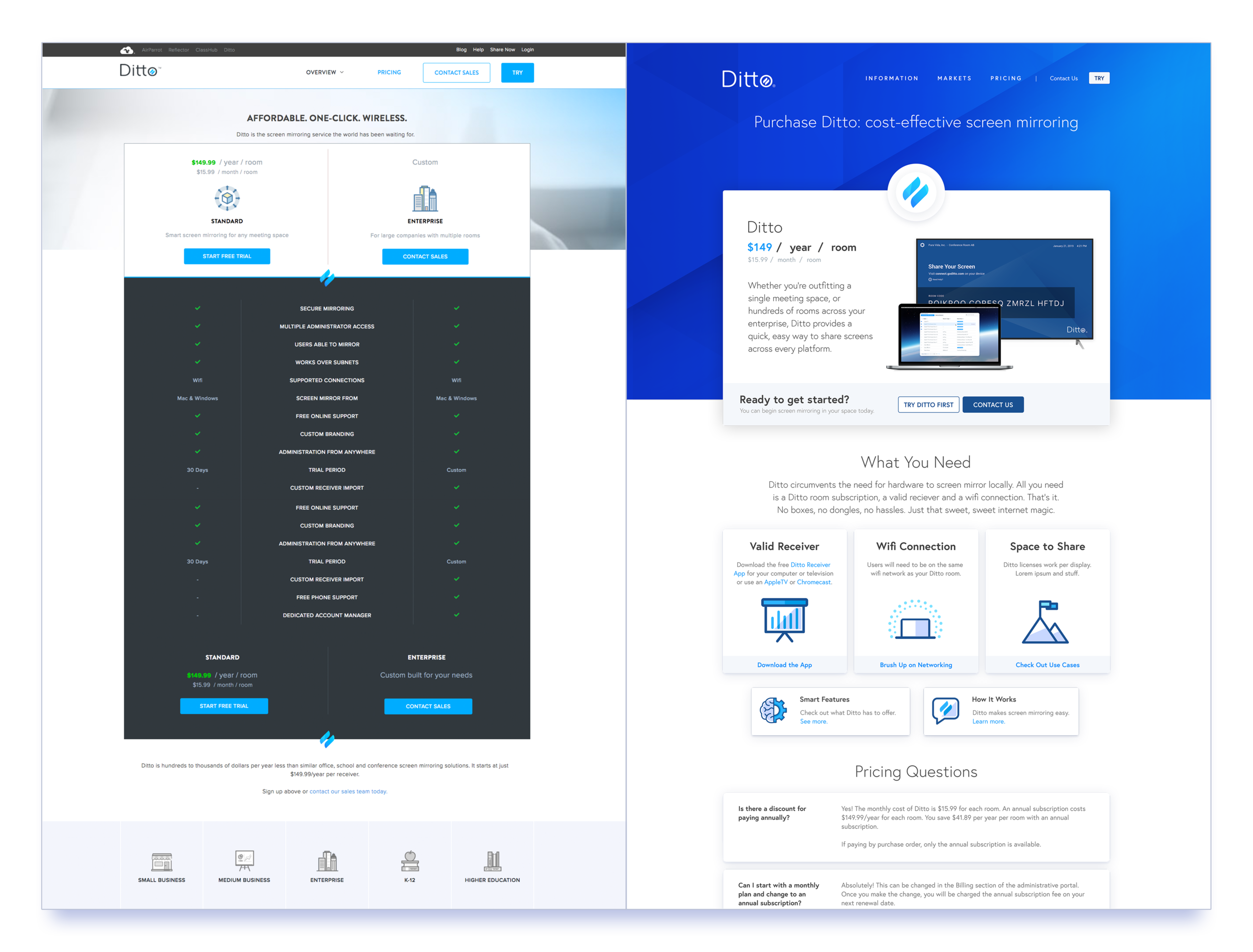
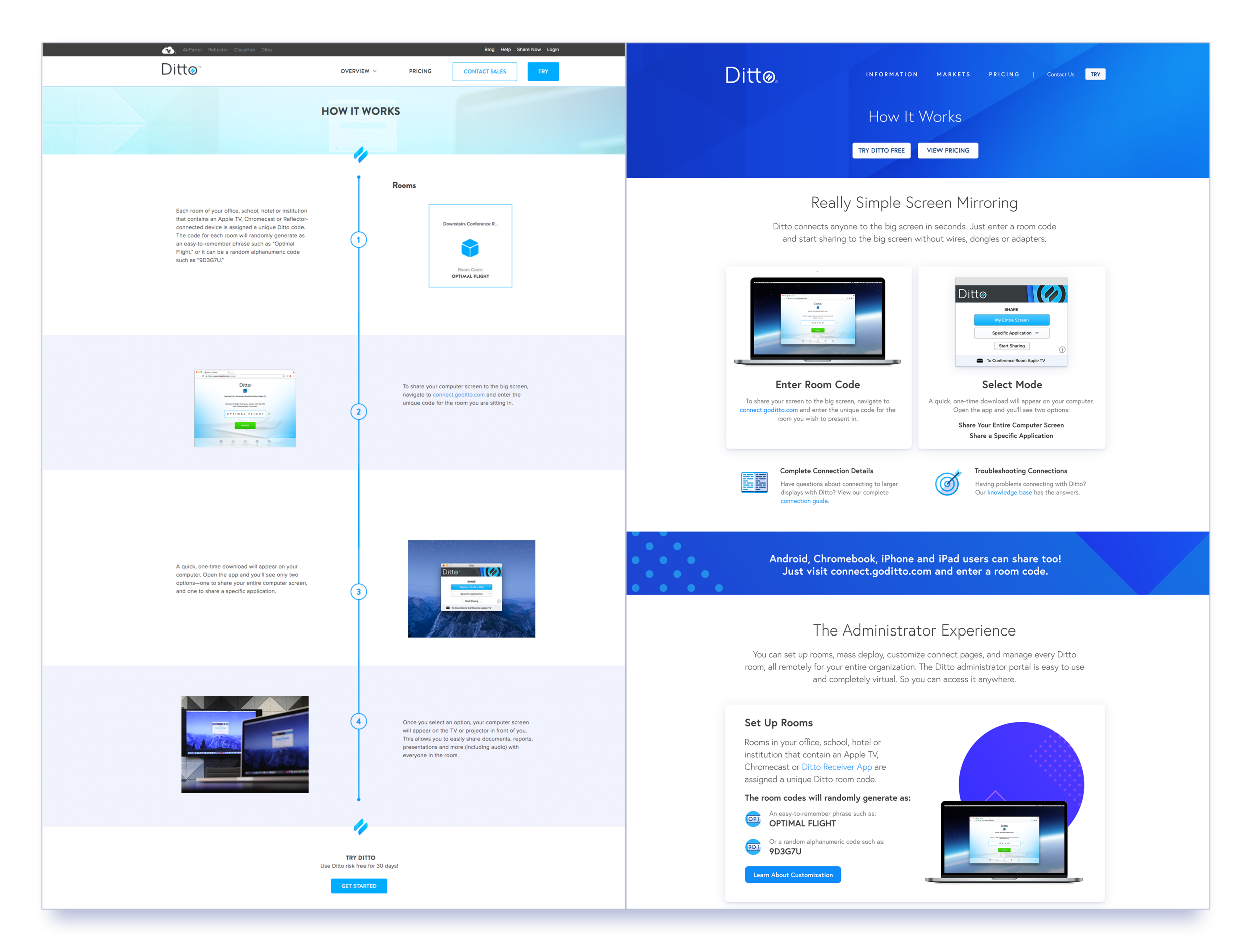
We developed a tiered sitemap to better cater to our primary user personas. Rather than traditional mapping, we focused on user journeys. Pages were connected by CTAs to advance a user toward a trial or toward more information.
Tier 1
Overview-level, easy-to-digest information. Minimal jargon. Easy access to trial, pricing and contact pages.
Tier 2
Product details for the moderately interested. Benefits, how it works, features and advantages.
Tier 3
Ditto for an organization or enterprise. Information that pertains to key market verticals.
Tier 4
High-information, often in-the-weeds, content for very interested and/or late-stage purchasers.
Page Iteration
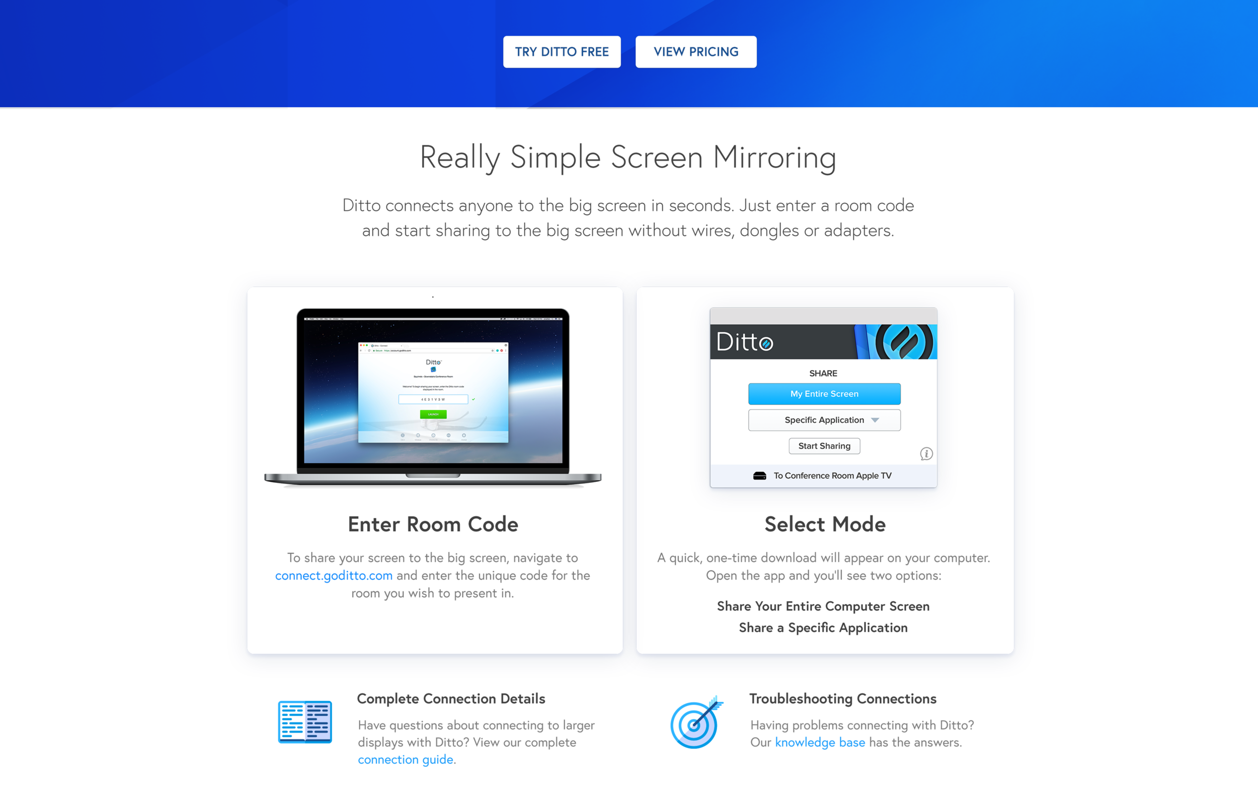
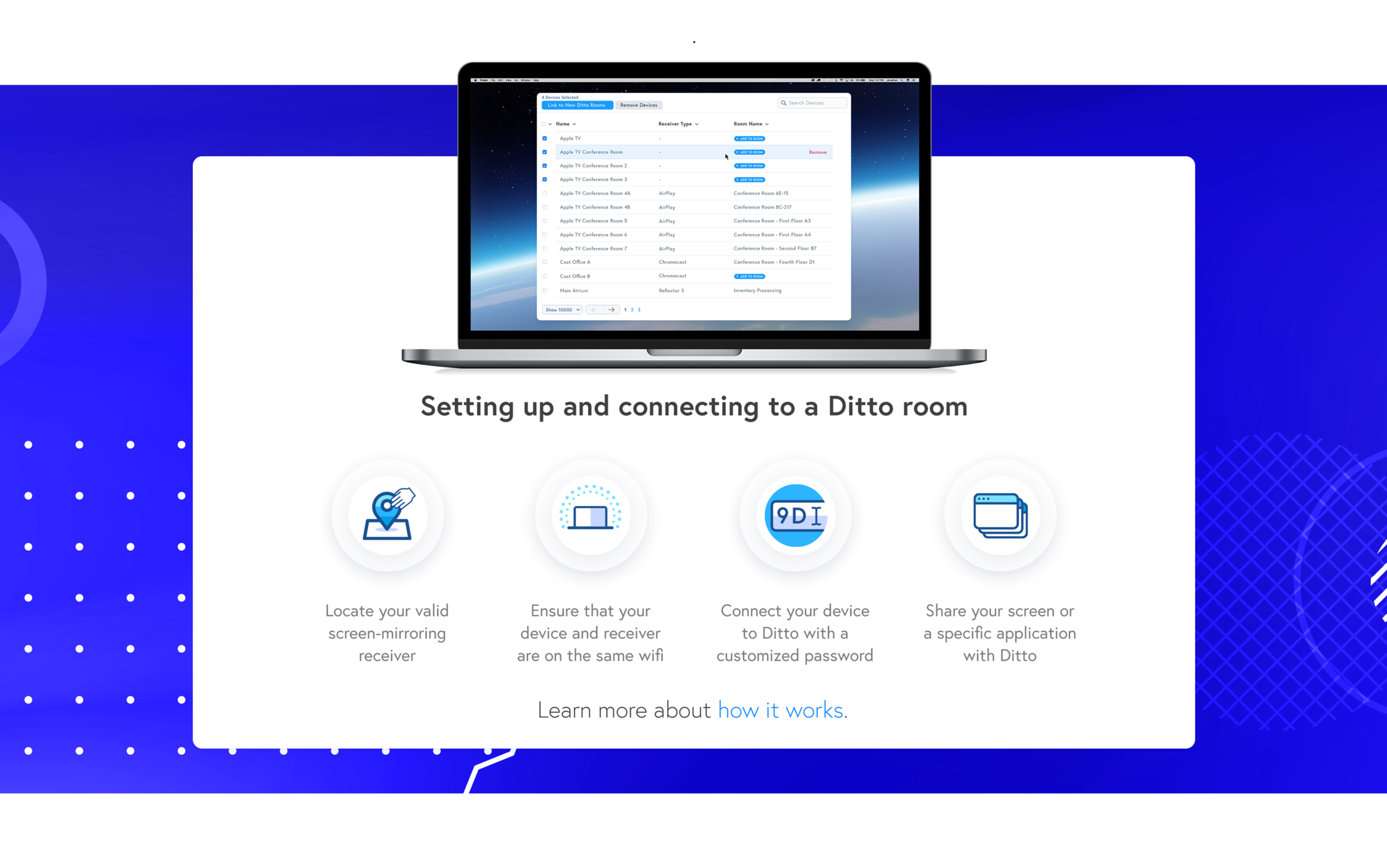
We followed the same process for every page. I would conduct brainstorming sessions, batched by Tier, with marketing. After talking through user journeys, information hierarchies, and CTAs; I’d compile a low fidelity wireframe to inform marketing’s writing. Once copy and UI were complete, a high-fidelity mock-up was generated. Imagery was added before development handoff, which was also batched by Tier. We iterated in early 2019, giving key pages more attention than we could afford in late 2017.


Asset Generation
Iconography


Module Maker
After our first iteration in late 2017, I developed a Module Maker file that contained rough mock ups, brand assets and backgrounds to speed up iteration between marketing and design, as well as enhance design communication between myself and my new web developer.

“Jon demonstrated excellent proficiency in organization, strategy, and execution with the Ditto web redesign. He has a great ability to develop ideas, looking at the big picture as well as micro-interactions. I enjoyed collaborating with Jon on this project.”
Learnings
Project Overview
The Ditto redesign represented a turning point in Squirrels creative and marketing techniques. The research phase alone changed how we wrote for and presented marketing materials. Adding and developing a “customer first” UX component at the beginning of our process enabled us to prioritize user journeys and information hierarchy over page themes and content saturation.
Moving forward, we prioritized web work over anything else, treating each site as a centerpiece for advertising efforts and communication. Ditto efforts, for instance, included the development of an online knowledge base, article integration with the Squirrels Blog, two email blasts, a social media advertising campaign, the development of a post-trial email flow and a post-purchase email flow, and a series of landing pages.
Pain Points
A single web designer bottlenecked our workflow and forced our first iteration to be executable within a four-day window.
Volatile development timelines pushed and pulled our time and resources into several different directions.
A hand-coded website made additions, revisions and even quick edits difficult for marketing to execute. Our turnaround was too long.
Our site lacked any integration and functionality beyond basic contact forms.
Expectations from key stakeholders, especially regarding timeline, were often too high.
Solutions
We hired an additional web designer, 50% available to marketing and specifically focused on interaction design and front-end coding.
Product ecosystems were adopted to improve communications between departments. I also invested in “passive design” techniques, researching and creating web assets in my free time, well before update or release pressures impacted marketing workflows.
The marketing team adopted the CMS HubSpot in mid 2018. We ported our websites and learned how to navigate and do basic coding on the platform.
HubSpot allowed us to create a new integrated blog, as well as develop email flows, run campaigns and host landing pages.
Recording the Ditto redesign process and communicating quantitative and qualitative data to key stakeholders eased timeline expectations.
Professional Development
This project signified a significant shift in my design thinking. As I learned to draw on other departments and coworkers, and tackled more complex strategic issues, I became more efficient and identified a need to automate significant portions of my reoccurring and minor jobs.
Just to satisfy my love for logging and graphing effort, below is a chart I created from my own independent time tracking. Idle time includes bathroom breaks, lunches and any time not working, preparing for or thinking about work.
Point B signifies the Ditto Site Redesign Kickoff and the shift between reactive and proactive design. The improvements mentioned above accounted for a trend toward baseline during major sprints, Points E, F, G, & J. As you can see, it took Point I, a severe concussion, to bring me back to pre-redesign idle time. I contribute a significant amount of my productivity to the process I devised, the improvements myself and my department made, and the pride derived from my new responsibilities.